
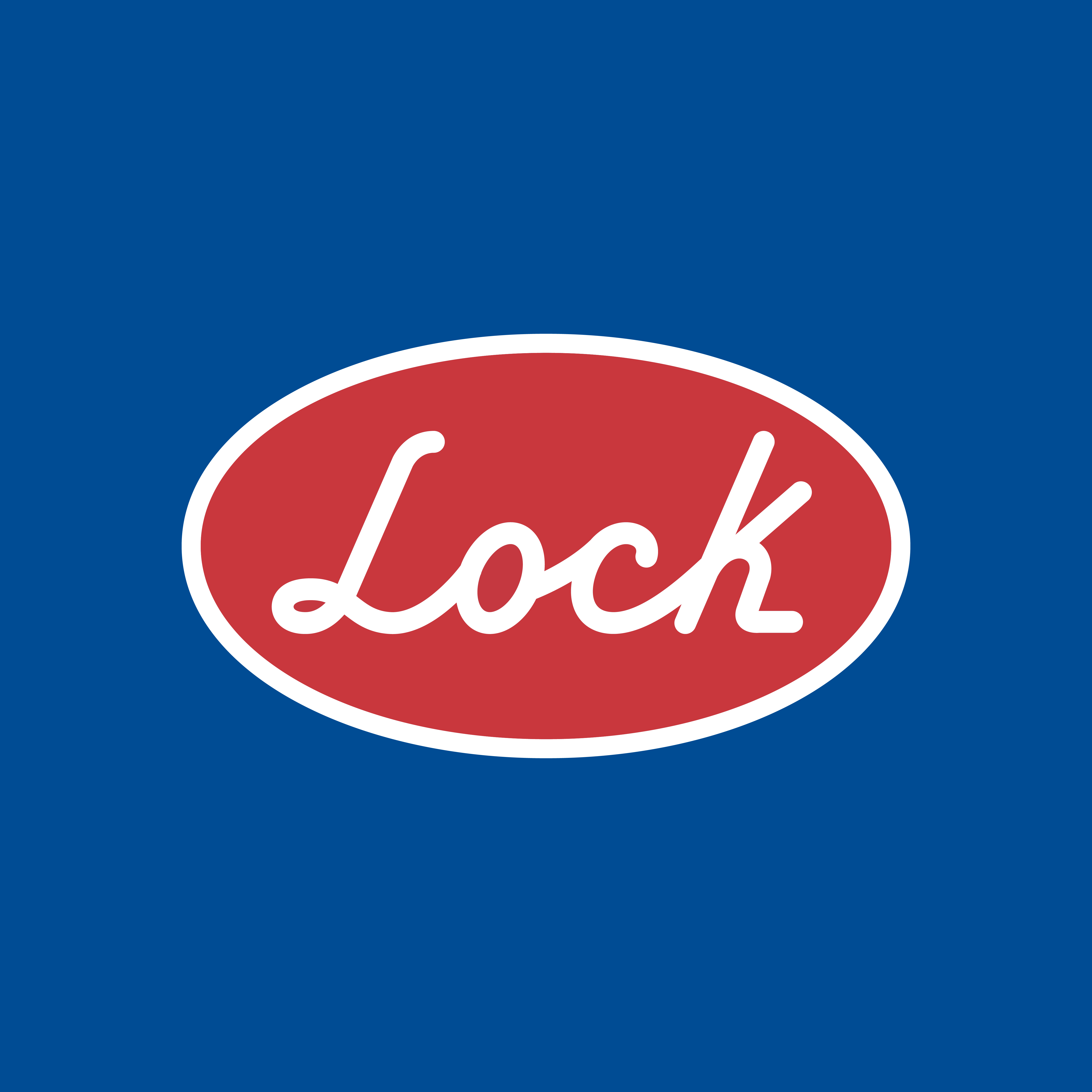
LOCK – RENOVATION FAITHFUL TO ITS PAST
Lock: Renovation Faithful to its past
Creating a recognizable brand is not an easy task, nor is renewing it.
The challenge was to renew without modifying the logo, and preserving the visual DNA of the brand throughout its history.
For Lock we created a new tagline, redesigned the brand and the basis for a new face on their product packaging system:
Creative Concept
Tagline
Brand Redesign
Brand Identity Guidelines
Brand Book
Packaging design
Iconography redesign

Solution: Siempre seguro (always safe)
Based on the original elements of the brand: lines, colors, visual components; we created a redesign that looks modern and fresh, with the necessary elements to preserve the valuable connection between the brand and its valuable history, and its customers.
A tagline that refers to the past, the history of the brand, as well as the safety features offered by the Lock product lines.


